STAND STRONG FITNESS

STAND STRONG FITNESS
An internationally award-winning fitness brand identity system built around a distinctive, flexing "S" symbol.
-
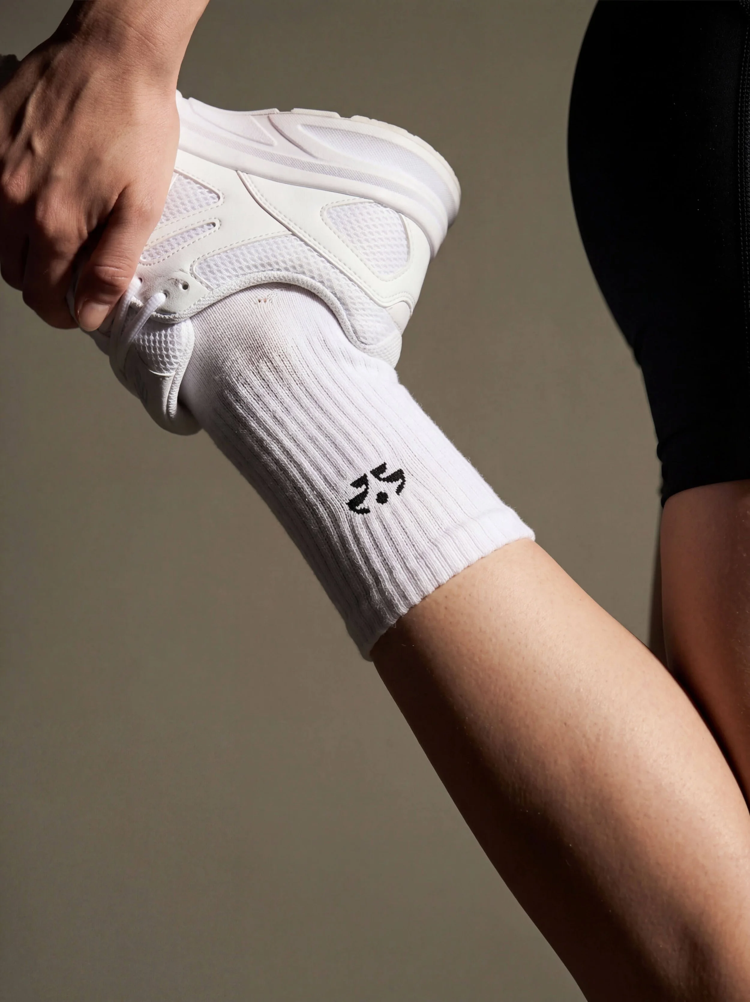
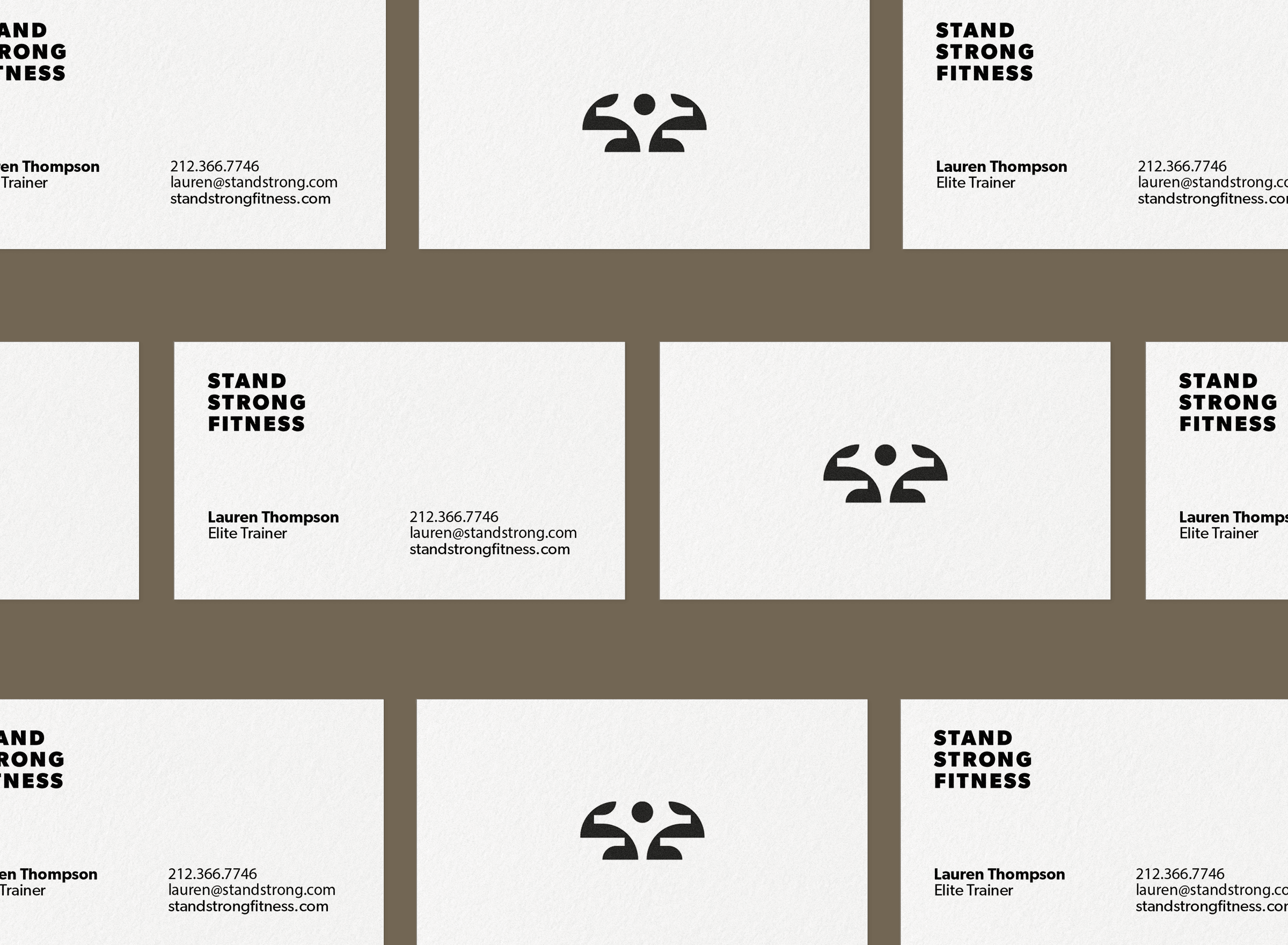
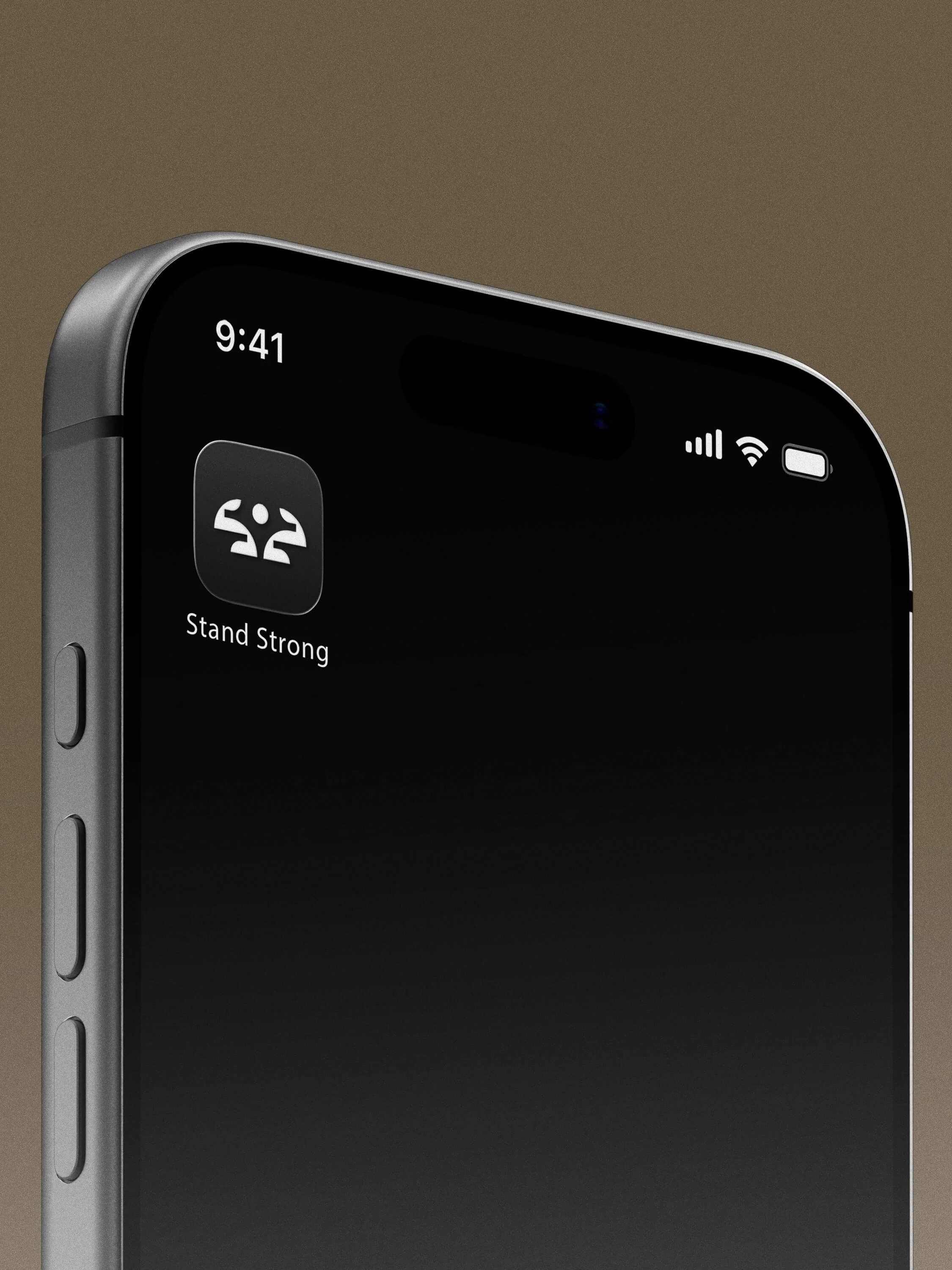
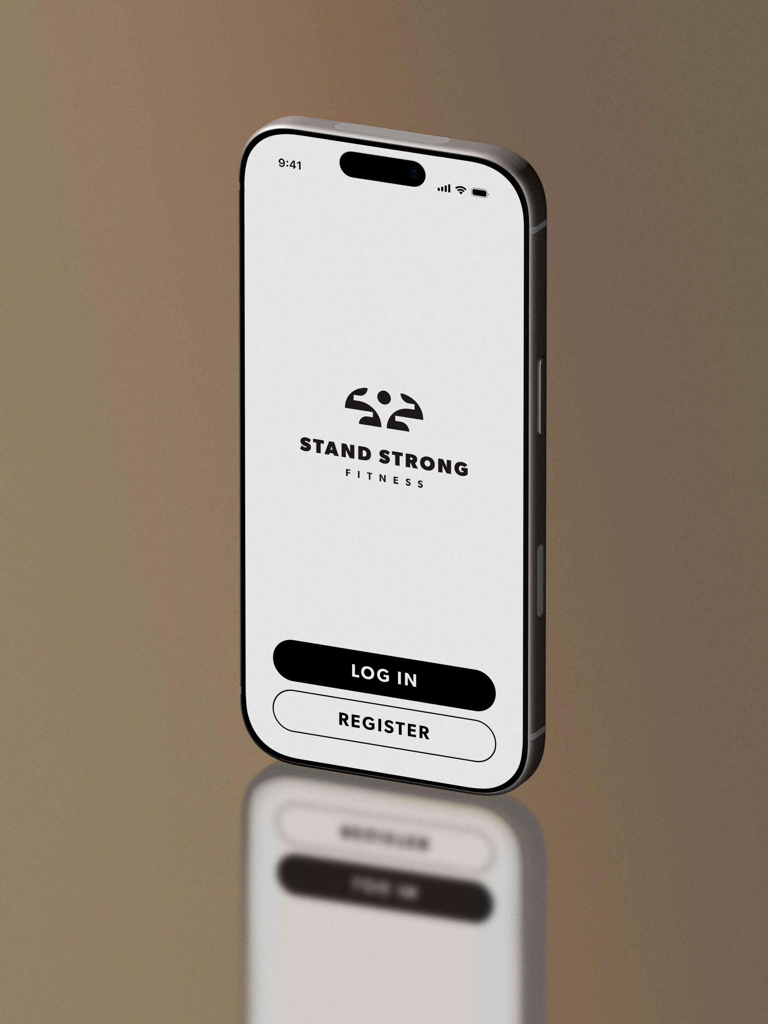
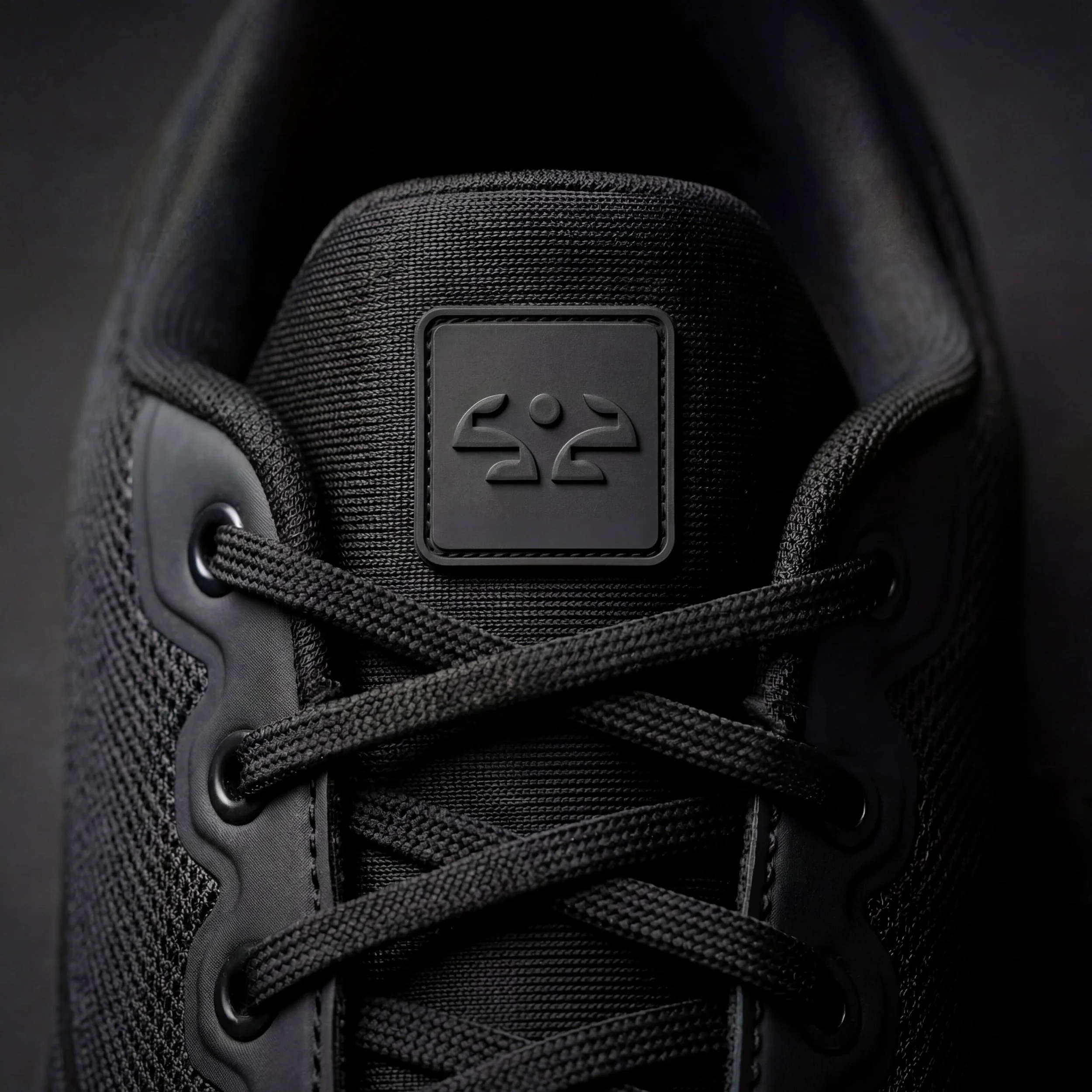
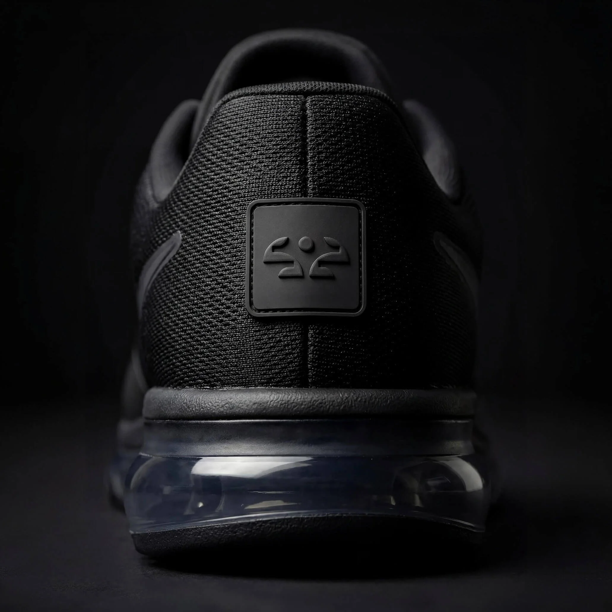
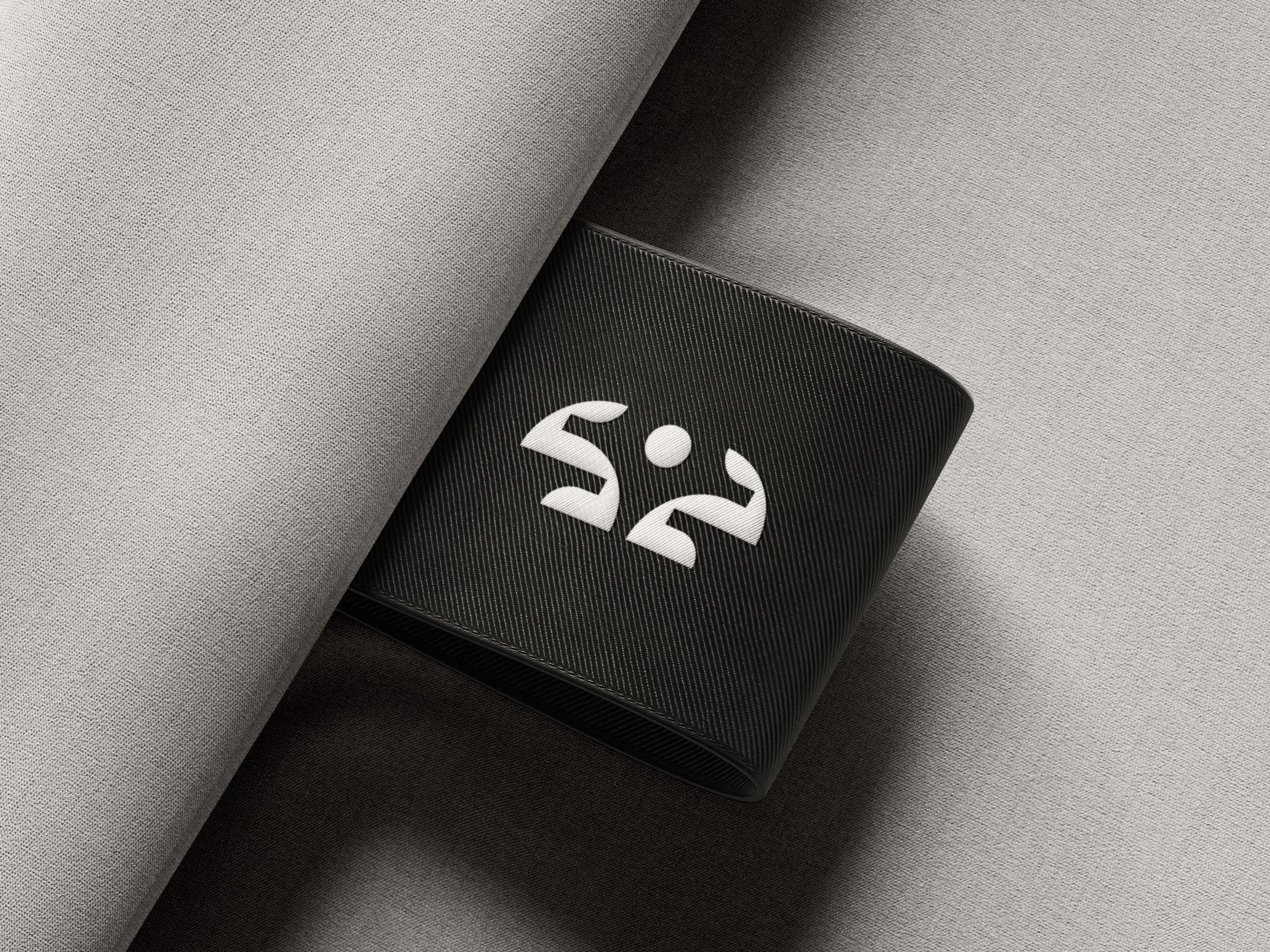
Stand Strong Fitness needed a brand identity that would embody strength, resilience, and an unwavering commitment to health and wellness. The solution centers on a bold, flexing "S" symbol, creating a distinctive visual mark that communicates confidence, movement, and determination while remaining simple, memorable, and highly versatile across digital and print applications.
The identity system was designed to inspire and motivate, reflecting the brand's mission to empower individuals to become stronger—both physically and mentally.
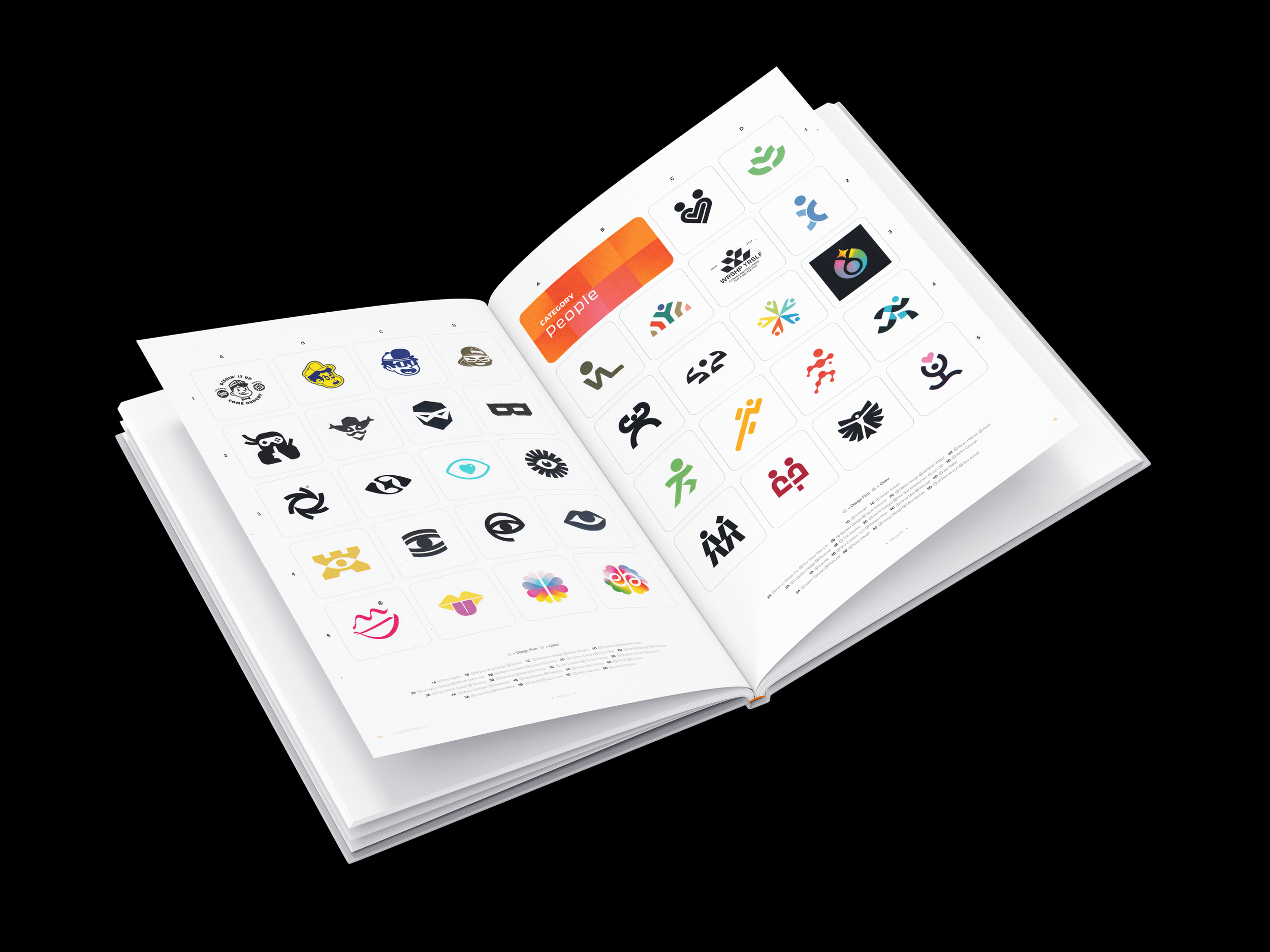
The logo received international recognition when it was selected for LogoLounge Book 15, one of the world's most respected logo design annuals. Chosen from more than 30,000 submissions by a panel of leading industry judges chaired by Paula Scher, the mark was among fewer than 10% of logos selected for publication—an honor that recognizes excellence in logo design on a global stage.






AWARD-WINNING IDENTITY
This logo received international recognition after being selected for LogoLounge Book 15, one of the world's most prestigious logo design annuals. Chosen from more than 30,000 submissions, it was among fewer than 10% of marks selected for publication, recognizing excellence in logo design on a global stage.